{ Netflix Original Series }
Netflix In From the Cold Synopsis – Exposed as an ex-Russian spy, an American single mom must juggle family life and unique shape-shifting skills in a battle against an insidious enemy. KEDRON was hired to create the Logo Brand Identity for the show along with creating the Show Title.
CBFX & KEDRON Collaboration
SHOW TITLE // Conceptual Progression
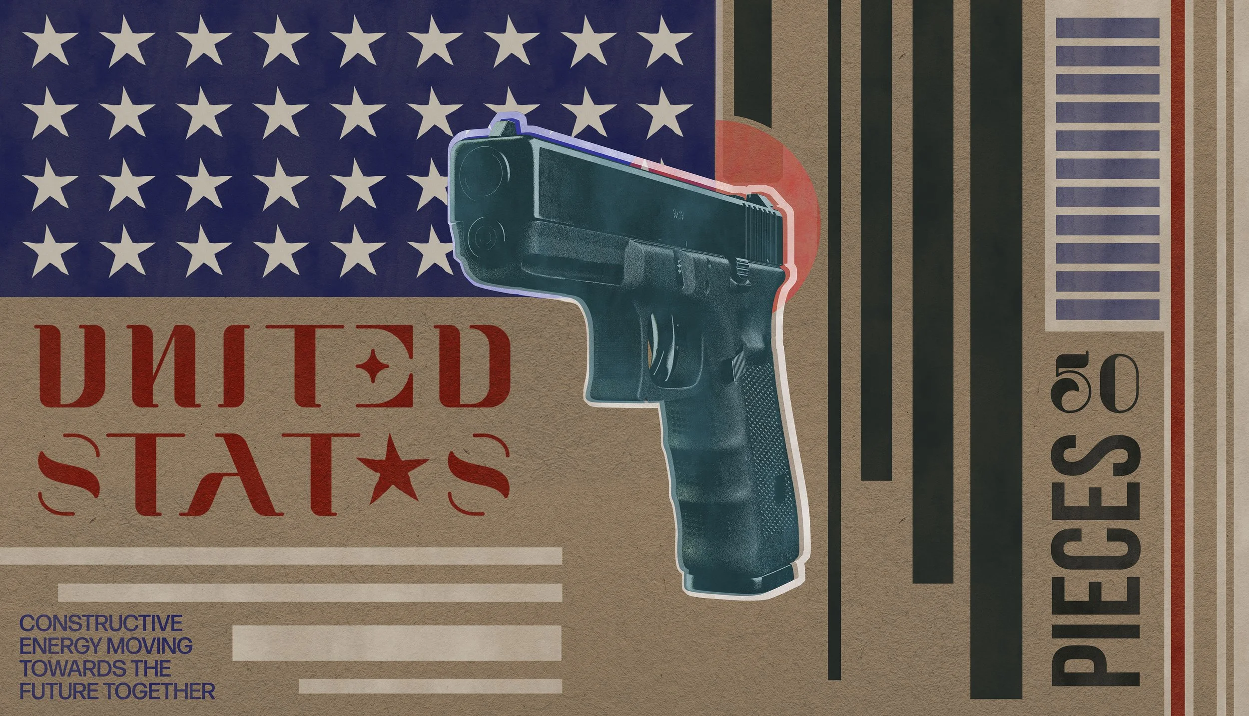
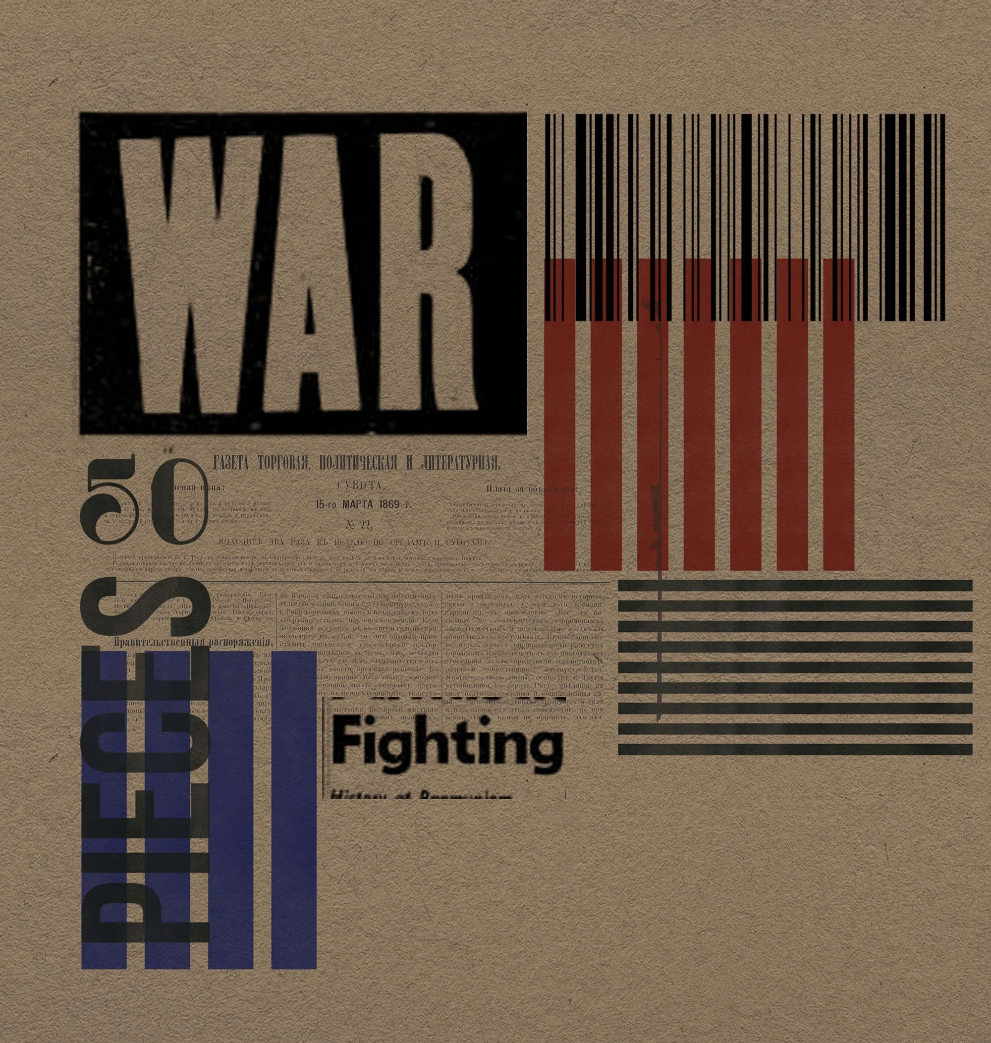
We played off of the Constructivism art movement: Blocky Shapes and Powerful Solid Colors. This visual language was prominent in the early twentieth-century and served as propaganda reflecting the modern industrial society. The palette was minimal, a manilla background that helped accentuate the accented colors of the striped yellow shapes and iconic Russian red sickle. It took several iterations to get the ‘O’ in Cold to pop as the focal point of action.
Several Motion Tests were done in development based on a concept centered on a bullet that would lead the viewer through the Show Title. The bullet was shot from the distant void and traveled through space finally puncturing the poster at the point of the ‘O” in the Show Title, In From the Cold.
LOGO BRAND IDENTITY // Conceptual Progression
We had the privilege to establish the Logo Brand Identity that set the stage for the entire show. Something Punchy and Bold that would stand clear for the viewer. We had a lot of free reign to develop the mark. The fun part about developing the typography was knowing before hand that the word ‘COLD’ would somehow house the central point of focus. We played with the Russian sickle icon to lend the viewer with some context up front.
CONCEPT // Conceptual Progression
Graphics and Typography played a big role in the overall conceptual development. We created looks based strongly on the Constructivism art as mentioned above. Leaning on strong composition and design with animation in mind was our approach in the early stages of development and throughout the entirety of the project.